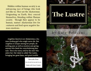
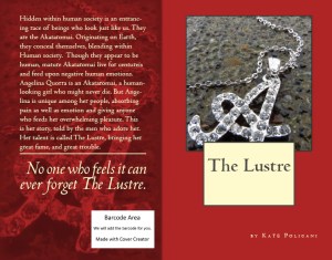
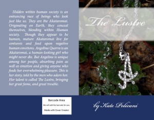
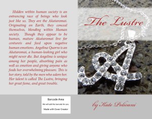
I have been messing around with CreateSpace Cover Creator, seeing what I might make into my cover! My photos are generously supplied by my Dad, who I hope will let me feature some of his other photographs for my Virtual Launch Party. What do you think? Which is your favorite?
Cover Noodling
Categories: My Books
Tags: art, Author, book, cover, cover art, CreateSpace, ebook, novel, photography
16 Comments


I like the red/gray cover the best. Definitely interested in reading this.
Thanks! I am looking for pre-reviewers for my Virtual Book Launch too! Pre-reviewers get it in ebook form for free before it is officially published.
Count me in. What is required to get on your list?
You just did! I’ll send out copies as soon as I get the final final edit back from my lovely Editor!
Cool.
The red jumps off the page first.
Kate, I like the first one (upper left) because the text is so legible, and all its elements look elegant together. My second pick is the red, which — it’s true — does jump off the page.
Would definitely like to read and review it, Kate. I just have no reader, so it would have to be in pdf (the format of my copy of Disenchanted Pet). ?
I can definitely send you a PDF.
That would be great! Thank you, Kate.
I like the red one, except the title box needs better color, bigger font and positioned so it doesn’t cover the image, and I’d like to see your (proud) author name in a larger font. 🙂
I agree. These were done with CreateSpace’s cover creator and they never quite look exactly the way I think they should look.
Red 🙂
It seems the authors like the red best with a few exceptions!
It is striking, Kate.
My Facebook friends like the black and cream cover best overall. I’ve decided to do 3 covers and let everybody have the one they like!
You know, this is the kind of smart solution publishing this way gives a writer.