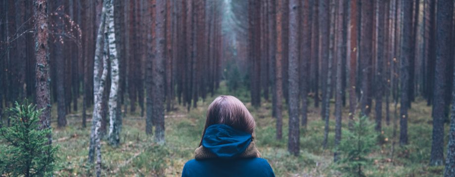
 I Seattle-ized this one. Is blue really better?


Been tweaking the cover more! Special thanks to Cynthia Mael, Marc Policani, Tahlia Newland, and Maria Tatham for their input! The back cover will be the same for all, except the first will have a tan back instead of red.
What do you think?
See them all here http://www.flickr.com/photos/katepolicani/sets/72157630198732104/


I quite like the top left hand one. I’m assuming that’s the original?
Yes. It’s just the picture with words added. It’s kind of a deconstruction approach.
I’m guessing that’s not what you’re after then?
No I think I like it best too. Sometimes less is more.
Very true
I like the first as well – it looks like something I’d easily pick up, especially for my younger sister.
The red on the others is lovely, but I don’t like the lettering.
I have trouble with fonts because there are so many.
It’s true, tons of good ones to choose from. On the red covers though it might just need to be smaller, or more lined up or something to be okay, as the font itself is nice.
I think I’m leaning more toward dumping the red covers. I’m getting lots of positive response from the picture-only cover.
Do these look too young? I’ve had feedback that the cover for The Disenchanted Pet looks like a kids’ book. I don’t want that to happen with Don’ Judge A Book….
Kate, I don’t think the covers look too young because of the neckline of her dress.
About the feedback on the cover of The Disenchanted Pet: Zarah looks young, but her Shazha doesn’t of course. For some reason, the simplicity mixed with horror of this image removes it from the YA shelf, I believe.
I added in a Seattle-style version. What do you think?
The Seattle-style version is the first image, correct? Its darker blue may make it too ominous and intense for your storyline. What do you think? I like the first one on the next line – paler blue with nice clouds.
It’s gray lol, because it is always cloudy here.
I’d go for Number 3, with the border and the black title. It stands out the most. I think the artwork needs the border, because it could look too childish without it.