
Did I scare you?
I’ve been working on cover designs to update Don’t Judge a Book By Its Magic. This is the winner of this round. What do you think? Any suggestions?
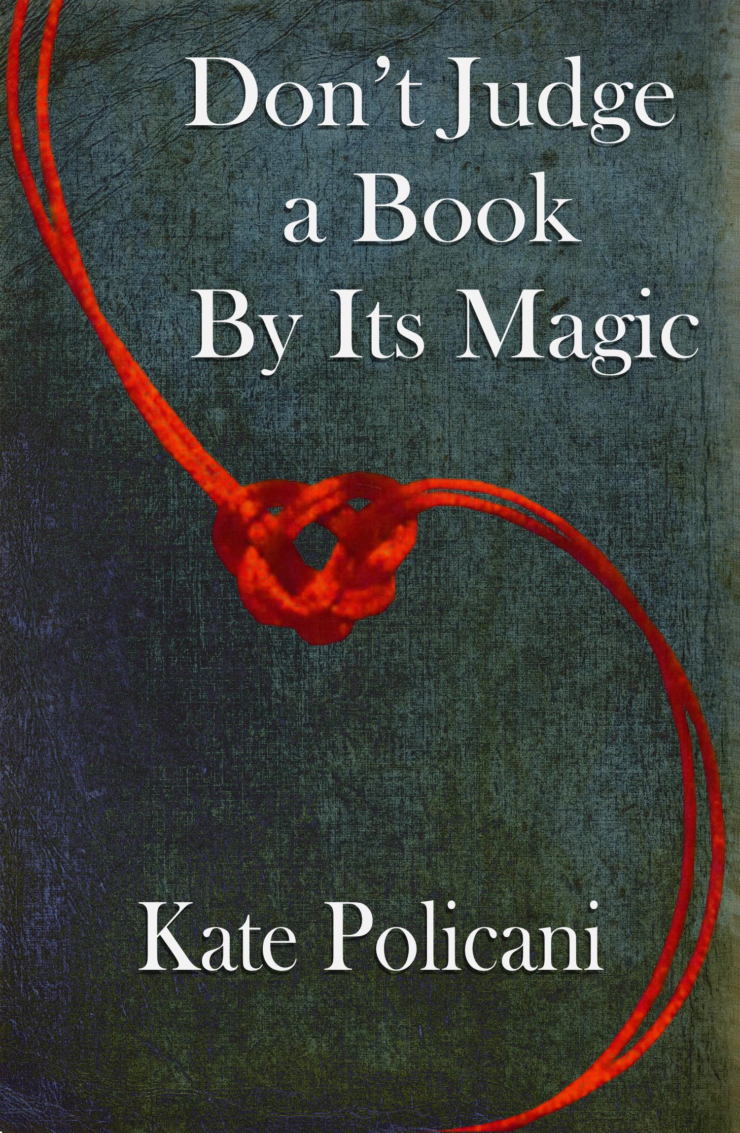
Is it an improvement over the original cover? (I love this cover but I’m told it looks too Middle Grade instead of New Adult)
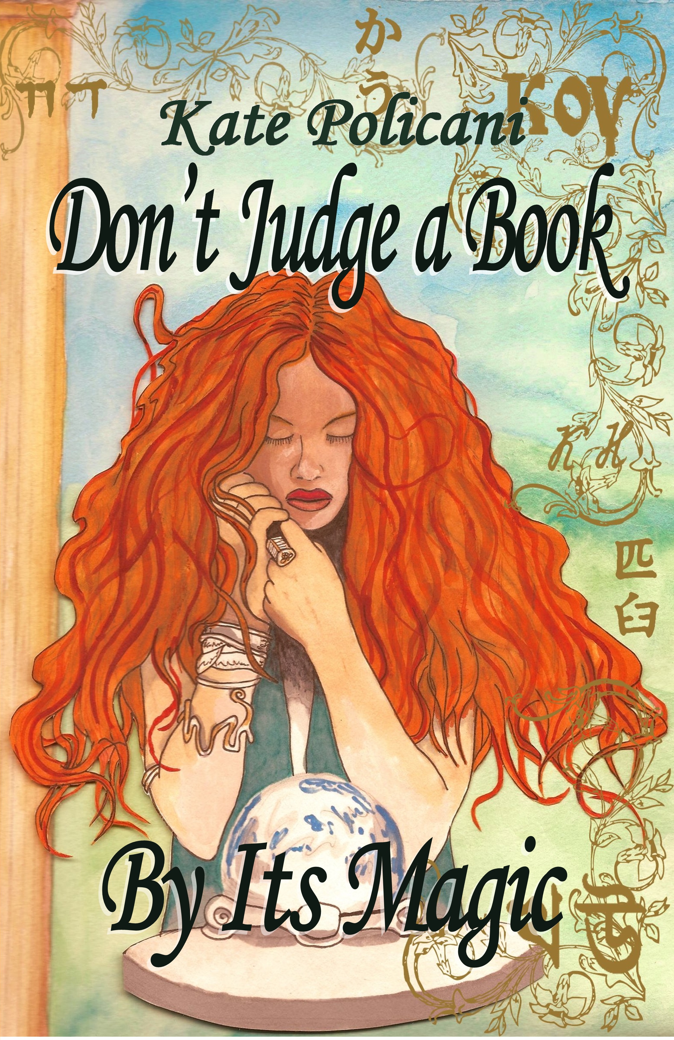


OOOOh! Kate, they are both nice for different reasons. but I have to say, I really like the quirkyness of the original. Please don’t sack me!
You are definitely not sacked! I love that one too, but I feel the pressure to conform! AACK!
Hi Kate,
Cover design is an interest of mine, and here’s my candid opinion…I prefer your original cover, for several reasons. The vivid color, the swirling, almost art nouveau look/feel of it, is much more engaging and interesting to the eye. The newer cover reminds me of the trend of very plain, simple covers like 50 Shades. Suddenly so many graphic designers seem to be jumping on that bandwagon. But just because we can, doesn’t mean we should. All others’ opinions aside, which cover speaks truer to *your* heart, and expresses the soul of your writing? Or, is there a hybrid cover possible that uses elements from both? I’ve been in the same maddening boat. Sometimes it helps enormously to set a project aside for a few days and let the subconscious simmer. Best, ~Brit
Good advice! The beauty is that I can always change it back.
They’re both lovely, but I have to admit, the new one would appeal more to a YA/NA audience. Go with the new one. It’ll be interesting to see if sales are affected.
Thanks Tima! I plan to change the digital but leave the print cover.
I’m for the new one because it’s more sophisticated and more contemporary.
I changed the cover of Lethal Inheritance for the same reasons. Instead of a teenager on it, it now has a flaming dagger. Your original is lovely, but it’s true that it does look middle grade and that limits the audience. My original cover for Lethal Inheritance was also lovely, but it looked YA. Since a lot of adults love the story, it was silly to have a cover that cut out all the adult readers simply because they saw a teenager on the front. Same here. The original cover, though a good design, probably cut out a lot of your potential market. The new design is elegant and fashionable, and will appeal to a wider range of readers. Lethal Inheritance has sold a lot better since the change, I hope the same happens to you.
I discovered that there’s a difference between a lovely cover and an effective one. http://tahlianewland.com/2013/09/14/why-its-a-good-idea-not-to-be-defensive-about-your-book-cover/
I’ve definitely seen an improvement with The Disenchanted Pet’s new cover too. Trendy covers might not appeal to the sense of individuality, but it’s an advertisement, not so much a personal statement.